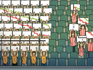
This editorial looks at how to present statistical information in a way that is easy for readers to interpret and apply, and calls on everyone involved writing educational material and press releases to make a conscious effort to use the most effective statistical formats.
 Seven simple lifestyle ‘steps’ can cut your risk of getting cancer by 51%. This carefully crafted message, recently publicised by the American Heart Association, was guaranteed to receive enormous media attention because of its simplicity coupled with the promise of halving the risk of contracting a highly feared disease. It is perhaps a good example of linking causes to promote healthier lifestyles. How far it helped anyone understand their own particular risks of getting cancer and how best to manage them, however, is more debatable.
Most of us, when we hear that something halves our risk, tend to think we have understood something meaningful. But if we have little idea about what level of risk we currently face – as is generally the case – then being told that our risk will halve is in practical terms meaningless. Am I halving my risk of ever getting this cancer from 2 in 100,000 to 1 in 100,000? In which case it may make sense to keep the lifestyle and accept the higher risk. Or do I have a 2 in 10 chance of getting that cancer within the next five years, in which case halving that risk to 1 in 10 might be worth some fairly major changes in lifestyle.
If we are to help people understand and take sensible precautions to manage their risk, we need to stop communicating ‘simple’ but often meaningless figures about relative risk – and think about how we present figures that help people get some perspective about what their actual (absolute) risk levels are, from which risk factors and for which cancers.
There is evidence to show that the statistical format used to present health information influ-ences how well people understand it, and their perception of risk. Changes in risk appear much larger and more impressive when using a relative risk format, and this can lead people to believe that an intervention is more effective than the available evidence demonstrates. This applies equally to the risk reduction benefits associated with preventative behaviours, screening and cancer treatments.
Talking in terms of absolute risk reduction is far more informative. Thus it is better to say: “If you do X you will reduce your chance of getting this cancer over the next 10 years from 3 in 1000 to 2 in 1000,” rather than: “If you do X it will reduce your chance of getting this cancer over the next 10 years by about one third.”
Using statistical formats everyone can understand is also advisable. It is better to use frequencies rather than percentages where possible – thus 60 out of 100 patients rather than 60% of patients. Graphs and other visual formats are also highly effective at conveying information involving probabilities.
Cancer has always suffered from disinformation and sensationalist claims and scares. The only way to counter this is through consistent and accurate information that is presented in a way that people can easily make sense of. This should become a standard for all educational literature that communicates risks about different aspects of cancer. It should also apply to press releases, so that news about cancer prevention, screening and treatment communicated by the mass media will be genuinely informative and less likely to lead to inaccurate beliefs about the potential of any intervention.


